
OUTFIT INSPIRATION
If I had a dollar for every time I was asked ‘What should we wear?’ I’d have a lot of dollars. It is the most commonly asked question I get once a session is booked. Here are some simple tips & tricks that work well for every family, along with lots of outfit inspiration, combos and patterns to really get you started. You know your family. You know their style and comfort. For your photoshoot you want to showcase that while taking it up a notch and making sure everyone is coordinating and looking their best.


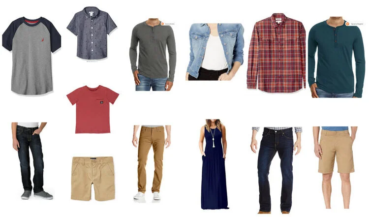
Want more details? Here are some things that really capture my attention and personal style and photograph really well!
-I like warm earth tones.
-I like neutrals.
-I like texture.
-I like flowy dresses that catch the wind and allow movement in our photos.
-I like outfits that look a little more eclectic and less like an Old Navy ad (although old navy is useful for pieces here and there.... just not the whole family.)
-Light colored khakis and polo shirts should be a thing of the past for dads and little boys. Put those guys in some dark jeans or dark khakis and a deep grey Henley.
-If the location allows it, go barefoot. I love the chill vibes it gives in photos.
-I’m just gonna say one more time. EARTH TONES.

Lastly, I wanted to mention some colors that DO NOT photograph well. These colors may look nice to us in person, but depending on the lighting and the location, they come off brighter, more saturated, and photograph neon. In addition, these colors tend to “color cast”, meaning they reflect color onto your faces and bodies and can make your skin appear really blue, green, yellow, and not a naturally beautiful skin tone that you usually have. For these reasons, the following colors tend to be on my “colors to avoid” list:
